 W
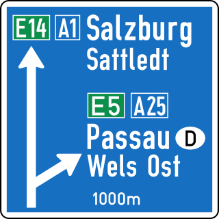
WAustria was the typeface formerly used on all official road signage in Austria made prior to 2010. A modified version of its German counterpart DIN 1451, it came in narrow- and medium-width fonts. Since 2010 it has been replaced on all new road signs by the more recently developed TERN typeface.
 W
WBrusseline is a custom typeface developed in 2006 by Eric de Berranger for the signage of the Brussels public transport network (STIB-MIVB) managing metro, pre-metro and trams. The typeface started being used on the network in 2007 as part of company image campaign. The name is inspired by Parisine, the typeface of Paris’ public transport network.
 W
WCartier is a family of serif old style typefaces designed by Carl Dair in 1967, who was commissioned by the Governor General of Canada-in-Council to create a new and distinctively Canadian typeface. The first proof of Cartier was published as "the first Canadian type for text composition" to mark the centenary of Canadian Confederation.
 W
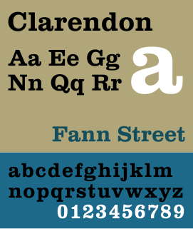
WClarendon is the name of a slab-serif typeface that was released in 1845 by Thorowgood and Co. of London, a letter foundry often known as the Fann Street Foundry. The original Clarendon design is credited to Robert Besley, a partner in the foundry, and was originally engraved by punchcutter Benjamin Fox, who may also have contributed to its design. Many copies, adaptations and revivals have been released, becoming almost an entire genre of type design.
 W
WClearview, also known as Clearview Hwy, is the name of a humanist sans-serif typeface family for guide signs on roads in the United States. It has also been used in Canada, Indonesia, the Philippines, Israel, and Sri Lanka. It was developed by independent researchers with the help of the Texas Transportation Institute and the Pennsylvania Transportation Institute, under the supervision of the Federal Highway Administration (FHWA). It was once expected to replace the FHWA typefaces in many applications, although newer studies of its effectiveness have called its benefits into question.
 W
WDIN 1451 is a sans-serif typeface that is widely used for traffic, administrative and technical applications.
 W
WDrogowskaz is a geometric sans-serif typeface used in public signage in Poland. Originally developed in 1975 by Marek Sigmund for the Ministry of Transportation and put into effect on April 1 of that year, it is currently used in accordance with the Ministry of Infrastructure regulation of July 3, 2003 on all types of road signs in Poland.
 W
WDubai is a sans-serif typeface commissioned by the Government of Dubai in partnership with Microsoft and designed by a six-member team led by Nadine Chahine from U.S.-based firm Monotype. It contains both Latin and Arabic script. The font, released on 30 April 2017, is included as part of Microsoft's Office 365, and is also available for free download. It will be used by all government departments in Dubai, according to the instruction of the Dubai Executive Council. It is the first Microsoft font named after a city.
 W
WEsseltub is the name of a typeface family used in the Stockholm Metro. It was designed by Stig Åke Möller and digitalised by Bo Berndal. In the 1980s it was replaced with black and white signs using Helvetica and they are now gradually being replaced by Veolia Transport with signs with yellow text on blue background using FF Meta.
 W
WThe FE-Schrift or Fälschungserschwerende Schrift is a sans serif typeface introduced for use on licence plates. Its monospaced letters and numbers are slightly disproportionate to prevent easy modification and to improve machine readability. It has been developed in Germany where it has been mandatory since November 2000.
 W
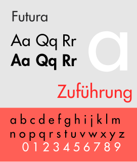
WFutura is a geometric sans-serif typeface designed by Paul Renner and released in 1927. It was designed as a contribution on the New Frankfurt-project. It is based on geometric shapes, especially the circle, similar in spirit to the Bauhaus design style of the period. It was developed as a typeface by the Bauer Type Foundry, in competition with Ludwig & Mayer's seminal Erbar typeface of 1926.
 W
WHelvetica or Neue Haas Grotesk is a widely used sans-serif typeface developed in 1957 by Swiss typeface designer Max Miedinger with input from Eduard Hoffmann.
 W
WHighway Gothic is a sans-serif typeface developed by the United States Federal Highway Administration and used for road signage in the Americas, including the U.S., Canada, and Latin American countries, with Asian countries influenced by American signage practices including the Philippines, China, Taiwan, Malaysia, Indonesia and Thailand. Variants, minor and major are used in countries like Turkey, Mexico, Australia, Spain, the Netherlands, Brazil, New Zealand, Macau, and some signs in countries like India and Saudi Arabia, when written in English. The typefaces were created to maximize legibility at a distance and at high speed. Computer typeface versions known as Highway Gothic or Interstate, which are for sale to the general public, include punctuation marks based on a rectangular shape. However, on signage the official FHWA Series punctuation is based on a circular shape.
 W
WJohnston is a sans-serif typeface designed by and named after Edward Johnston. The typeface was commissioned in 1913 by Frank Pick, commercial manager of the Underground Electric Railways Company of London, as part of his plan to strengthen the company's corporate identity. Johnston was originally created for printing, but it rapidly became used for the enamel station signs of the Underground system as well.
 W
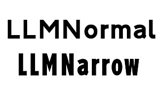
WLLM Lettering is a set of sans-serif typefaces developed by the Malaysian Highway Authority and used for road signage on expressways in Malaysia. The font was divided into two types: LLM Normal (Standard/Regular) and LLM Narrow (Condensed). The LLM Normal typeface is a modified form of the Italian Alfabeto Normale and Alfabeto Stretto. The lettering is special use for the Malaysian Expressway System.
 W
WMandatory is a typeface developed from the Charles Wright typeface, introduced for use on vehicle registration plates of the United Kingdom. Its block letters and numbers are designed to prevent easy modification and to improve legibility, with stroke separation on the M and W which are pointed at the centre, and the tail of the Q which is thinner and clearer. It was developed in the United Kingdom, and is also used by Brazil, where it has been mandatory between 2008 and 2018, before the adoption of Mercosur plates. The Mandatory font can be downloaded free for personal use from K-Type.
 W
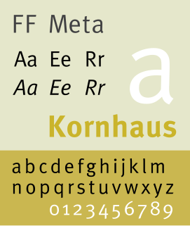
WFF Meta is a humanist sans-serif typeface family designed by Erik Spiekermann and released in 1991 through his FontFont library. According to Spiekermann, FF Meta was intended to be a "complete antithesis of Helvetica", which he found "boring and bland". It originated from an unused commission for the Deutsche Bundespost. Throughout the 1990s, FF Meta was embraced by the international design community with Spiekermann and E. M. Ginger writing that it had been dubiously praised as the Helvetica of the 1990s.
The National Fonts are sets of freely-licensed computer fonts for the Thai script sponsored by the Thai government. The original National Fonts include three Thai typefaces released by NECTEC in 2001, while a follow-up program, more specifically known as the thirteen National Fonts, or colloquially SIPA fonts, include thirteen typefaces distributed and used by the Government of Thailand as public and official fonts after they won a national competition held in 2007. The fonts and all of their subsequently developed versions are released by the Software Industry Promotion Agency, or SIPA, together with the Department of Intellectual Property through f0nt.com, and can be downloaded freely on the website.
 W
WNetwork is a sans-serif typeface originally created by Monotype for use on the transport network in the Birmingham/West Midlands metropolitan area in the United Kingdom. The typeface is based on VAG Rounded, which was previously the typeface used by the West Midlands Passenger Transport Executive for public information in the county.
 W
WNPS Rawlinson Roadway is an old style serif typeface currently used on the United States National Park Service's road signs. It was created by Terminal Design to replace Clarendon. Type designer James Montalbano named the typeface after his wife's surname, as her father worked for the Forest Service.
 W
WParisine is a typeface created by Jean-François Porchez. Distributed by Typofonderie.
 W
WRail Alphabet is a typeface designed by Jock Kinneir and Margaret Calvert for signage on the British Rail network. First used at Liverpool Street station, it was then adopted by the Design Research Unit (DRU) as part of their comprehensive 1965 rebranding of the company.
 W
WSNV is a sans-serif typeface used on road signs in several European countries. It was originally defined by the Association of Swiss Road Traffic Experts and the Swiss Association for Standardization.
 W
WSweden Sans is a sans-serif typeface developed by Söderhavet design agency for exclusive use by Swedish government ministries, agencies and corporations.
 W
WToronto Subway is a geometric sans-serif typeface designed for the original section of the Toronto Transit Commission’s Yonge subway. It is today used at station entrances, fare booths and track level signage throughout the system.
 W
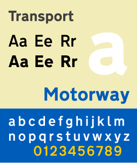
WTransport is a sans serif typeface first designed for road signs in the United Kingdom. It was created between 1957 and 1963 by Jock Kinneir and Margaret Calvert as part of their work as designers for the Department of Transport's Anderson and Worboys committees.
 W
WTratex is a geometric sans-serif typeface family for road signs in Sweden. It was developed for maximal readability in traffic, and designed by Karl-Gustaf Gustafsson.