 W
WThe social science of economics makes extensive use of graphs to better illustrate the economic principles and trends it is attempting to explain. Those graphs have specific qualities that are not often found in other sciences.
 W
WThe AD–AS or aggregate demand–aggregate supply model is a macroeconomic model that explains price level and output through the relationship of aggregate demand and aggregate supply.
 W
WIn economics, a backward-bending supply curve of labour, or backward-bending labour supply curve, is a graphical device showing a situation in which as real (inflation-corrected) wages increase beyond a certain level, people will substitute leisure for paid worktime and so higher wages lead to a decrease in the labour supply and so less labour-time being offered for sale.
 W
WA Beveridge curve, or UV curve, is a graphical representation of the relationship between unemployment and the job vacancy rate, the number of unfilled jobs expressed as a proportion of the labour force. It typically has vacancies on the vertical axis and unemployment on the horizontal. The curve, named after William Beveridge, is hyperbolic-shaped and slopes downward, as a higher rate of unemployment normally occurs with a lower rate of vacancies. If it moves outward over time, a given level of vacancies would be associated with higher and higher levels of unemployment, which would imply decreasing efficiency in the labour market. Inefficient labour markets are caused by mismatches between available jobs and the unemployed and an immobile labour force.
 W
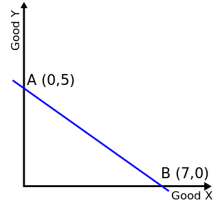
WIn economics, a budget constraint represents all the combinations of goods and services that a consumer may purchase given current prices within his or her given income. Consumer theory uses the concepts of a budget constraint and a preference map to analyze consumer choices. Both concepts have a ready graphical representation in the two-good case. The consumer can only purchase as much as their income will allow, hence they are constrained by their budget. The equation of a budget constraint is where P_x is the price of good X, and P_y is the price of good Y, and m = income.
 W
WIn microeconomics, the contract curve is the set of points representing final allocations of two goods between two people that could occur as a result of mutually beneficial trading between those people given their initial allocations of the goods. All the points on this locus are Pareto efficient allocations, meaning that from any one of these points there is no reallocation that could make one of the people more satisfied with his or her allocation without making the other person less satisfied. The contract curve is the subset of the Pareto efficient points that could be reached by trading from the people's initial holdings of the two goods. It is drawn in the Edgeworth box diagram shown here, in which each person's allocation is measured vertically for one good and horizontally for the other good from that person's origin ; one person's origin is the lower left corner of the Edgeworth box, and the other person's origin is the upper right corner of the box. The people's initial endowments are represented by a point in the diagram; the two people will trade goods with each other until no further mutually beneficial trades are possible. The set of points that it is conceptually possible for them to stop at are the points on the contract curve. However, some authors identify the contract curve as the entire Pareto efficient locus from one origin to the other.
 W
WIn economics, a demand curve is a graph depicting the relationship between the price of a certain commodity and the quantity of that commodity that is demanded at that price. Demand curves may be used to model the price-quantity relationship for an individual consumer, or more commonly for all consumers in a particular market. It is generally assumed that demand curves are downward-sloping, as shown in the adjacent image. This is because of the law of demand: for most goods, the quantity demanded will decrease in response to an increase in price, and will increase in response to a decrease in price.
 W
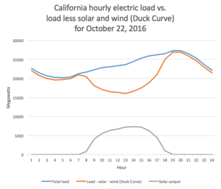
WIn utility-scale electricity generation, the duck curve is a graph of power production over the course of a day that shows the timing imbalance between peak demand and renewable energy production. The term was coined in 2012 by the California Independent System Operator.
 W
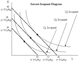
WIn economics, an expansion path is a curve in a graph with quantities of two inputs, typically physical capital and labor, plotted on the axes. The path connects optimal input combinations as the scale of production expands. A producer seeking to produce a given number of units of a product in the cheapest possible way chooses the point on the expansion path that is also on the isoquant associated with that output level.
 W
WThe Great Gatsby curve is a chart plotting the relationship between inequality and intergenerational social immobility in several countries around the world.
 W
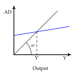
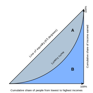
WIn a 2-dimensional Cartesian coordinate system, with x representing the abscissa and y the ordinate, the identity line or line of equality is the y = x line. The line, sometimes called the 1:1 line, has a slope of 1. When the abscissa and ordinate are on the same scale, the identity line forms a 45° angle with the abscissa, and is thus also, informally, called the 45° line. The line is often used as a reference in a 2-dimensional scatter plot comparing two sets of data expected to be identical under ideal conditions. When the corresponding data points from the two data sets are equal to each other, the corresponding scatters fall exactly on the identity line.
 W
WIn economics, an indifference curve connects points on a graph representing different quantities of two goods, points between which a consumer is indifferent. That is, any combinations of two products indicated by the curve will provide the consumer with equal levels of utility, and the consumer has no preference for one combination or bundle of goods over a different combination on the same curve. One can also refer to each point on the indifference curve as rendering the same level of utility (satisfaction) for the consumer. In other words, an indifference curve is the locus of various points showing different combinations of two goods providing equal utility to the consumer. Utility is then a device to represent preferences rather than something from which preferences come. The main use of indifference curves is in the representation of potentially observable demand patterns for individual consumers over commodity bundles.
 W
WThe IS–LM model, or Hicks–Hansen model, is a two-dimensional macroeconomic tool that shows the relationship between interest rates and assets market. The intersection of the "investment–saving" (IS) and "liquidity preference–money supply" (LM) curves models "general equilibrium" where supposed simultaneous equilibria occur in both the goods and the asset markets. Yet two equivalent interpretations are possible: first, the IS–LM model explains changes in national income when price level is fixed short-run; second, the IS–LM model shows why an aggregate demand curve can shift. Hence, this tool is sometimes used not only to analyse economic fluctuations but also to suggest potential levels for appropriate stabilisation policies.
 W
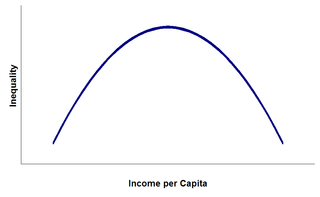
WThe Kuznets curve expresses a hypothesis advanced by economist Simon Kuznets in the 1950s and 1960s. According to this hypothesis, as an economy develops, market forces first increase and then decrease economic inequality.
 W
WIn statistics and business, a long tail of some distributions of numbers is the portion of the distribution having many occurrences far from the "head" or central part of the distribution. The distribution could involve popularities, random numbers of occurrences of events with various probabilities, etc. The term is often used loosely, with no definition or arbitrary definition, but precise definitions are possible.
 W
WIn economics, the Lorenz curve is a graphical representation of the distribution of income or of wealth. It was developed by Max O. Lorenz in 1905 for representing inequality of the wealth distribution.
 W
WIn economics and particularly in international trade, an offer curve shows the quantity of one type of product that an agent will export ("offer") for each quantity of another type of product that it imports. The offer curve was first derived by English economists Edgeworth and Marshall to help explain international trade.
 W
WThe Phillips curve is a single-equation economic model, named after William Phillips, describing an inverse relationship between rates of unemployment and corresponding rates of rises in wages that result within an economy. Stated simply, decreased unemployment, in an economy will correlate with higher rates of wage rises. Phillips did not himself state there was any relationship between employment and inflation; this notion was a trivial deduction from his statistical findings. Samuelson and Solow made the connection explicit and subsequently Milton Friedman and Edmund Phelps put the theoretical structure in place. In so doing, Friedman was to successfully predict the imminent collapse of Phillips' a-theoretic correlation.
 W
WA production–possibility frontier (PPF), production possibility curve (PPC), or production possibility boundary (PPB), or Transformation curve/boundary/frontier is a curve which shows various combinations of the amounts of two goods which can be produced within the given resources and technology/a graphical representation showing all the possible options of output for two products that can be produced using all factors of production, where the given resources are fully and efficiently utilized per unit time. A PPF illustrates several economic concepts, such as allocative efficiency, economies of scale, opportunity cost, productive efficiency, and scarcity of resources.
 W
WThe Rahn curve is a graph used to illustrate an economic theory, proposed in 1996 by American economist Richard W. Rahn, which suggests that there is a level of government spending that maximises economic growth. The theory is used by classical liberals to argue for a decrease in overall government spending and taxation. The inverted-U-shaped curve suggests that the optimal level of government spending is 15–25% of GDP.
WIn microeconomics, supply and demand is an economic model of price determination in a market. It postulates that, holding all else equal, in a competitive market, the unit price for a particular good, or other traded item such as labor or liquid financial assets, will vary until it settles at a point where the quantity demanded will equal the quantity supplied, resulting in an economic equilibrium for price and quantity transacted.
 W
WThe Elephant Curve, also known as the Lakner-Milanovic graph or the global growth incidence curve, is a graph that illustrates the unequal distribution of income growth for individuals belonging to different income groups. The original graph was published in 2013 and illustrates the change in income growth that occurred from 1988 to 2008. The x axis of the graph shows the percentiles of the global income distribution. The y axis shows the cumulative growth rate percentage of income .The main conclusion that can be drawn from the graph is that the global top 1% experienced around a 60% increase in income, whereas the income of the global middle class increased 70 to 80%. The graph is most commonly cited as a representation of the global income inequality that has occurred in part due to globalization.
WA Beveridge curve, or UV curve, is a graphical representation of the relationship between unemployment and the job vacancy rate, the number of unfilled jobs expressed as a proportion of the labour force. It typically has vacancies on the vertical axis and unemployment on the horizontal. The curve, named after William Beveridge, is hyperbolic-shaped and slopes downward, as a higher rate of unemployment normally occurs with a lower rate of vacancies. If it moves outward over time, a given level of vacancies would be associated with higher and higher levels of unemployment, which would imply decreasing efficiency in the labour market. Inefficient labour markets are caused by mismatches between available jobs and the unemployed and an immobile labour force.
 W
WIn finance, the yield curve is a curve showing several yields to maturity or interest rates across different contract lengths for a similar debt contract. The curve shows the relation between the interest rate and the time to maturity, known as the "term", of the debt for a given borrower in a given currency.
W