 W
WThe accordion is a graphical control element comprising a vertically stacked list of items, such as labels or thumbnails. Each item can be "expanded" or "collapsed" to reveal the content associated with that item. There can be zero expanded items, exactly one, or more than one item expanded at a time, depending on the configuration.
 W
WIn a web browser, the address bar is a GUI widget that shows the current URL. The user can type a URL into the bar to navigate to a chosen website; in most modern browsers, non-URLs are automatically sent to a search engine. In a file browser, it serves the same purpose of navigation, but through the file-system hierarchy.
 W
WIn graphical user interfaces, the control element adjustment handle is a small box that appears on the corners and edges of a selected element such as another graphical control element like a window. This allows the user to alter size or shape.
 W
WA wallpaper or background is a digital image used as a decorative background of a graphical user interface on the screen of a computer, smartphone or other electronic device. On a computer, wallpapers are generally used on the desktop, while on a mobile phone they serve as the background for the home screen. Though most devices come with a default background image, modern devices usually allow users to manually change the background image.
 W
WA context menu is a menu in a graphical user interface (GUI) that appears upon user interaction, such as a right-click mouse operation. A context menu offers a limited set of choices that are available in the current state, or context, of the operating system or application to which the menu belongs. Usually the available choices are actions related to the selected object. From a technical point of view, such a context menu is a graphical control element.
 W
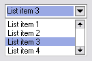
WA drop-down list is a graphical control element, similar to a list box, that allows the user to choose one value from a list. When a drop-down list is inactive, it displays a single value. When activated, it displays a list of values, from which the user may select one. When the user selects a new value, the control reverts to its inactive state, displaying the selected value. It is often used in the design of graphical user interfaces, including web design.
 W
WA graphical widget in a graphical user interface is an element of interaction, such as a button or a scroll bar. Controls are software components that a computer user interacts with through direct manipulation to read or edit information about an application. User interface libraries such as Windows Presentation Foundation, GTK, and Cocoa, contain a collection of controls and the logic to render these.
 W
WLiteStep is a Windows Shell replacement for Windows 9x and up, licensed under the terms of the GNU General Public License (GPL).
 W
WIn software design, the look and feel of a graphical user interface comprises aspects of its design, including elements such as colors, shapes, layout, and typefaces, as well as the behavior of dynamic elements such as buttons, boxes, and menus. The term can also refer to aspects of a non-graphical user interface, as well as to aspects of an API – mostly to parts of an API that are not related to its functional properties. The term is used in reference to both software and websites.
 W
WThe Marcus Bains line is a line that shows the current time in many calendar applications and PIM suites. Usually, it is a red horizontal line showing at the location of the current time in the "day" or "week" views of a calendar, sometimes complemented with the current time.
 W
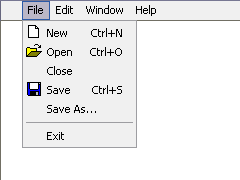
WIn computing and telecommunications, a menu is a list of options or commands presented to the user of a computer or communications system. A menu may either be a system's entire user interface, or only part of a more complex one.
 W
WA paned window is a windows in a graphical user interface that has multiple parts, layers, or sections. Examples of this include a code browser in a typical integrated development environment; a file browser with multiple panels; or a web page that contains multiple frames. Simple console applications use an edit pane for accepting input and an output pane for displaying output.
 W
WIn computing, a pointer or mouse cursor is a symbol or graphical image on the computer monitor or other display device that echoes movements of the pointing device, commonly a mouse, touchpad, or stylus pen. It signals the point where actions of the user take place. It can be used in text-based or graphical user interfaces to select and move other elements. It is distinct from the cursor, which responds to keyboard input. The cursor may also be repositioned using the pointer.
 W
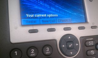
WA soft key is a button flexibly programmable to invoke any of a number of functions rather than being associated with a single fixed function or a fixed set of functions. A softkey often takes the form of a screen-labeled function key located alongside a display device, where the button invokes a function described by the text at that moment shown adjacent to the button on the display. Soft keys are also found away from the display device, for example on the sides of cellular phones, where they are typically programmed to invoke functions such as PTT, memo, or volume control. Function keys on keyboards are a form of soft key. In contrast, a hard key is a key with dedicated function such as the keys on a number keypad.
 W
WStacks are a feature found in Apple's macOS, starting in Mac OS X Leopard. As the name implies, they "stack" files into a small organized folder on the Dock. At the WWDC07 Keynote Presentation, Steve Jobs stated that in Leopard, the user will be given a default stack called Downloads, in which all downloaded content will be placed.
 W
WIn interface design, a tabbed document interface (TDI) or Tab is a graphical control element that allows multiple documents or panels to be contained within a single window, using tabs as a navigational widget for switching between sets of documents. It is an interface style most commonly associated with web browsers, web applications, text editors, and preference panes, with window managers, especially tiling window managers, being lesser known examples.
 W
WIn computer interface design, a toolbar is a graphical control element on which on-screen buttons, icons, menus, or other input or output elements are placed. Toolbars are seen in many types of software such as office suites, graphics editors and web browsers. Toolbars are usually distinguished from palettes by their integration into the edges of the screen or larger windows, which results in wasted space if too many underpopulated bars are stacked atop each other or interface inefficiency if overloaded bars are placed on small windows.
 W
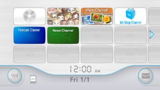
WThe Wii Menu is the graphical shell of the Wii game console, as part of the Wii system software. It has four pages, each with a 4:3 grid, and each displaying the current time and date. Available applications, known as "channels", are displayed and can be navigated using the pointer capability of the Wii Remote. The grid is customizable; users can move channels among the menu's 47 customizable slots by pressing and holding the A and B button while hovering over the channel the user wants to move. By pressing the plus and minus buttons on the Wii Remote users can scroll across accessing empty slots.